A single Gospel line — the small, resonant phrase that points to the Feeding of the Five Thousand and to Jesus as the 'bread of life' — can become a quiet daily anchor when translated into Christian wall art. A short, visible verse or promise carries the narrative memory of a Gospel scene while offering ordinary encouragement: a reminder of provision, an invitation to trust, and a steadying word in the flow of household life.
The feeding miracle itself appears in all four canonical Gospels (Matthew 14:13–21; Mark 6:30–44; Luke 9:10–17; John 6:1–14). The story’s striking particulars—five loaves and two fish and twelve baskets of leftovers—make the episode unusually imageable and naturally suited to a concise visual reading that can fit a frame or a canvas without losing its narrative weight.
John’s account places the feeding within a broader theological frame: the episode introduces the theme of Jesus as the 'bread of life' and is often read in light of the manna tradition and sacramental or eucharistic readings. That association gives a brief Gospel line both comforting simplicity and sacramental depth; a single phrase on the wall can be at once a memory of miracle, an echo of manna, and a prompt to thanksgiving.
Standard commentaries commonly treat the feeding as demonstration of God’s provision and compassion, and as an occasion that invites the offering of small resources. As an image or a short verse on the wall, that pastoral teaching becomes accessible in daily routines: the visible word can recall generosity in small acts, reassure a household of God’s care, and encourage the practice of giving and receiving within ordinary life.
Scholarly work on domestic religion shows that objects and images kept in the home function as mnemonic devices and shape devotional practice. Practical scripture-memory programs make the same point, recommending visible placements—index cards or sticky notes on a mirror, a refrigerator, or another frequent sightline—to support repetition and recollection. Evidence-informed guidance on environment design likewise shows that visible cues increase the likelihood of repeated behavior; a verse presented in a clear, well-placed way thus becomes a reliable prompt to read, pray, or meditate.
Design considerations sharpen that promise. Principles such as typographic hierarchy, legibility, contrast, restrained font pairing, suitable sizing above furniture, and considered lighting help a verse become both readable and beautiful. The loaves-and-fishes motif also has a long history in Christian visual culture and carries provision and eucharistic symbolism; used subtly alongside a short Gospel line, it offers a layered but uncluttered visual language that suits a quiet interior.
Contemporary Christian marketplaces already offer verse-centred prints in formats like canvas, typographic posters, and framed verses, reflecting both the demand for and the practicality of this approach. When a designer keeps the Gospel line central and the layout simple, the result is more than decoration: it is domestic Scripture made visible, a daily cue that supports biblical memory, quiet encouragement, and a simple, steady beauty in the home.


 ↧ Digital download
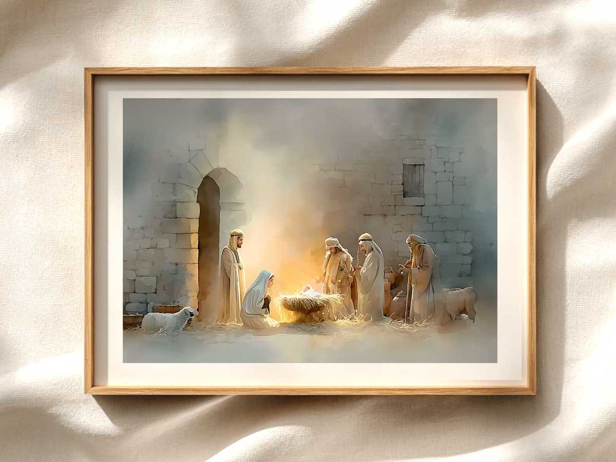
The Magi’s Adoration on Canvas: Traditional Christian Canvas Wall...
Digital download
↧ Digital download
The Magi’s Adoration on Canvas: Traditional Christian Canvas Wall...
Digital download
 ↧ Digital download
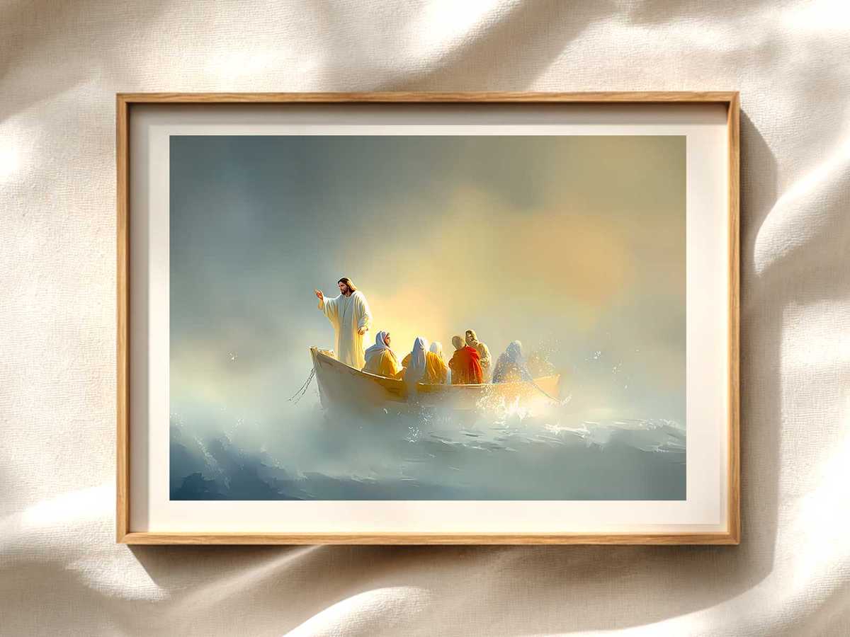
Jesus Art: The Stilled Storm — A Quiet Icon of Christ’s Gentle...
Digital download
↧ Digital download
Jesus Art: The Stilled Storm — A Quiet Icon of Christ’s Gentle...
Digital download
 ↧ Digital download
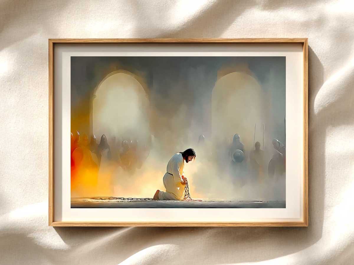
Drawings of Jesus Christ Print: The Trial and the Silent Dignity of...
Digital download
↧ Digital download
Drawings of Jesus Christ Print: The Trial and the Silent Dignity of...
Digital download
 ↧ Digital download
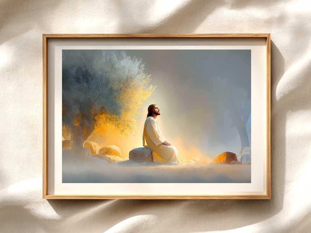
Gethsemane Drawing with Bible Verse Wall Art: A Quiet Companion for...
Digital download
↧ Digital download
Gethsemane Drawing with Bible Verse Wall Art: A Quiet Companion for...
Digital download